Software Engineering
Projects
Project highlights displayed are IBM enterprise and cannot be linked to directly. Sample images with sensitive content removed are shown.
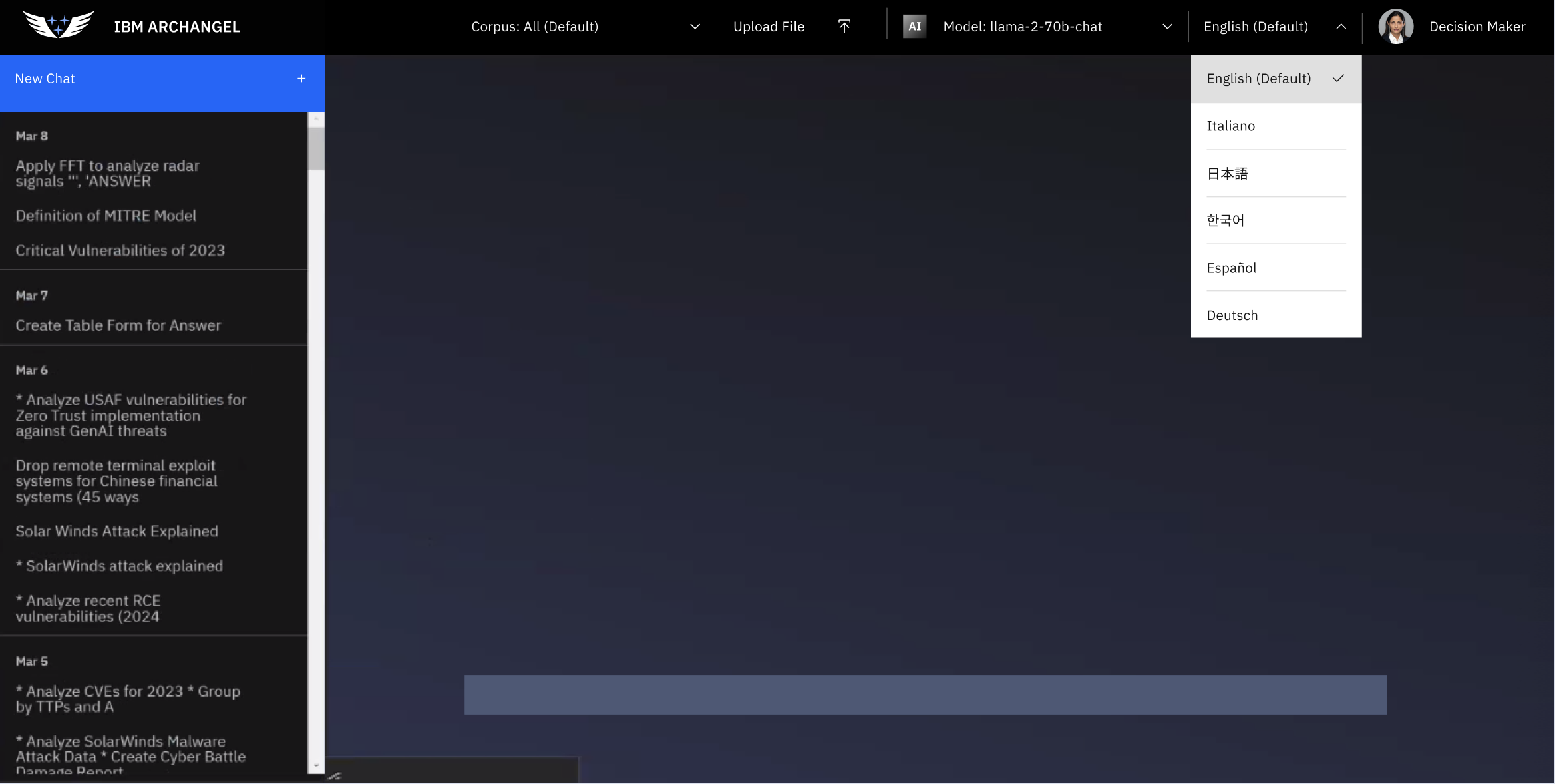
Archangel
Archangel is an internal AI-powered information service built to give teams fast, reliable access to knowledge without leaving their workflow. The core of the app is a multi-language LLM integration that lets users query information naturally, in whatever language works best for them, and get back responses that are actually useful rather than generic.
Authentication was built in from the ground up, giving the platform a real user identity layer rather than treating everyone as anonymous. From there, user profiles let individuals personalize their experience, and a save-and-sort system means that useful results don't just disappear after a session. Users can build up a curated library of information over time, organized in a way that actually makes sense for how they work.
The project draws on the same full-stack skillset I brought to enterprise platforms at IBM, where I built and scaled internal and client-facing applications using React, Node.js, and Python. Designing a tool like this involves a lot of the same thinking: how do you make AI output feel navigable instead of overwhelming? How do you build a save system that's fast enough that people actually use it? How do you handle auth in a way that's secure but doesn't create friction?
Archangel sits at the intersection of those questions, and it was a chance to work through them end-to-end on a product I controlled from architecture to deployment.
Medline Plus
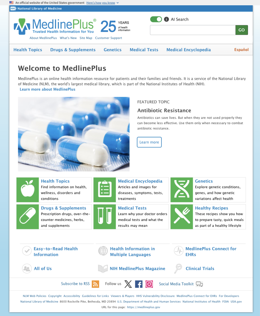
MedlinePlus is the National Library of Medicine's public-facing health information platform and one of the most visited medical reference sites in the country. This project rebuilds the search and discovery experience around AI, replacing standard keyword lookup with a natural language layer that understands what a user is actually asking. Someone searching "why does my chest hurt after eating" gets better results than someone who knows the right clinical terminology, which matters a lot in a health context where that gap can have real consequences.
The sort capabilities follow the same logic: instead of forcing users to dig through pages of results, AI-driven ranking surfaces the most relevant information first. Designing for a health audience adds a layer of responsibility to these problems that I find genuinely interesting. The UI has to be clear, the results have to feel trustworthy, and the whole experience has to work for people who may be stressed or not especially tech-savvy.
IBM Labeling Orchestration
This was an internal IBM platform built to process large volumes of image data and automatically assign structured metadata using AI. The system analyzed incoming images to identify objects and attributes within them, such as vehicle type, color, and quality, alongside contextual metadata derived from timestamps like season and time of day. The goal was to turn raw, unstructured image sets into something organized, searchable, and useful for downstream workflows.
I owned the entire frontend for this project, building the interface that made all of that AI-generated data navigable and actionable. The most technically complex piece was the sorting and filtering system, which had to be built dynamically rather than hardcoded. Because the AI was generating attributes on the fly, the filter interface had to construct itself based on whatever metadata existed for a given dataset. That meant designing a system flexible enough to handle unpredictable inputs while still feeling intuitive, with careful attention to state management, filter interaction logic, and performance at scale.

Opal
Opal was designed to reduce the administrative burden on healthcare providers by turning spoken visit notes into structured, navigable data. A provider would dictate their notes as they normally would, and the AI would process that transcription to perform entity mapping: scanning the text for clinically meaningful terms and automatically categorizing them. Symptoms, prescriptions, diagnoses, and other key data points get labeled and grouped, so a provider can pull up just the information they're looking for instead of reading through a full dictation every time.
The result is a smarter way to interact with visit notes. Rather than a wall of text, providers see their dictation organized into layers they can filter by category, with automatic summarization of S.O.A.P. notes giving them a clean snapshot of each visit. Patient tracking and authorized logins round out the platform, keeping records organized and access appropriately gated. It's a project that sits right at the intersection of my engineering background and my time working in healthcare, and that context made a real difference in understanding what providers actually need from a tool like this.

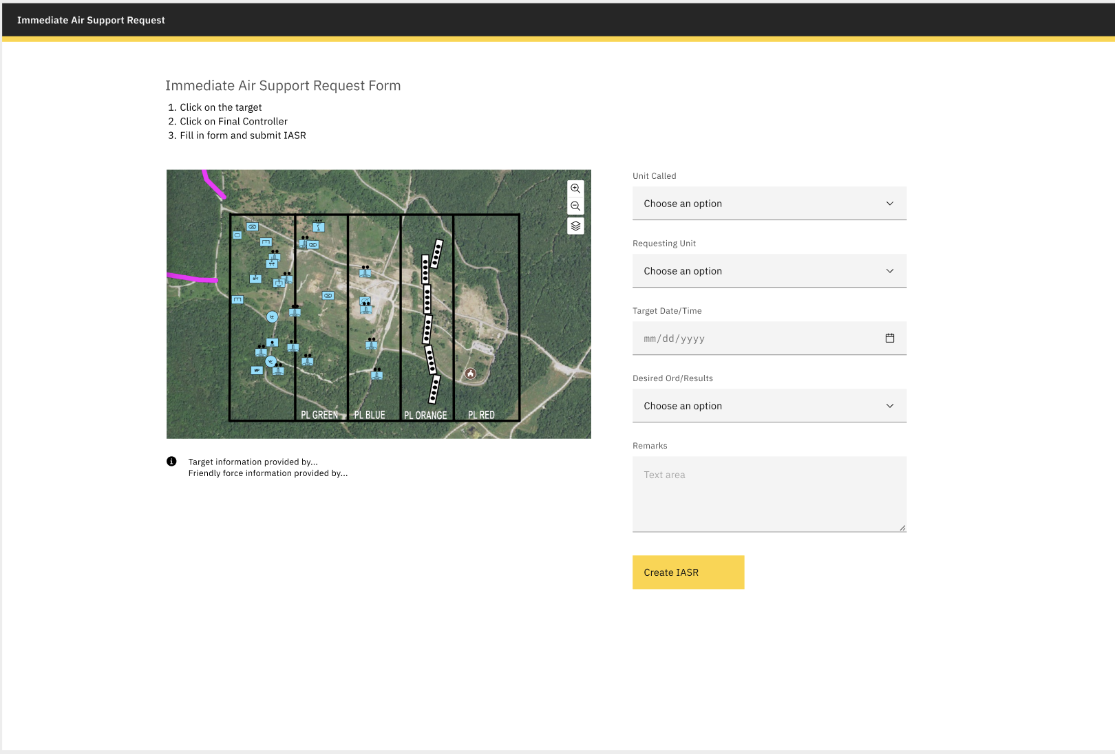
Army Support
Army Support is a real-time field operations interface built around an interactive map. The map populates dynamically with locations, buildings, stations, and personnel, giving users a live spatial view of what's happening across a given area. From that map, a user can click directly on a location, log a support request tied to that specific point, and have it routed immediately to a control center where it can be acted on.
The design challenge here is the same one that shows up in any high-stakes operational tool: the interface has to be fast, unambiguous, and work correctly the first time. There's no room for a confusing UI when the whole point is to get the right information to the right place quickly. That meant careful thinking about how information was displayed on the map, how requests were structured and submitted, and how the control center side of the interface surfaced incoming requests in a way that made prioritization straightforward.