UX/UI
Projects
Website Design
Rooted in a belief that great design is felt before it's understood, my website work lives at the intersection of visual clarity and purposeful interaction. From the initial wireframe to the final deployed product, I approach every project through Figma — building structured component systems, iterating on layout and hierarchy, and sweating the details that most people never consciously notice but always feel. The result is sites that don't just look considered, but are considered: where typography earns its weight, spacing creates rhythm, and every interaction has a reason to exist. Whether I'm crafting a minimal portfolio presence or a layered, content-rich experience, the through-line is the same — design that serves the person using it, and leaves an impression long after they've left the page.


Logos & Icons
I partner with individuals and organizations to design branded logos, icons, and visual embellishments that actually fit who they are. Whether it's for a product launch, an event, or a full brand refresh, every piece starts with a conversation and gets built out through an iterative process that keeps the client's voice at the center.
Everything I create is hand-drawn in Photoshop and Procreate. That means no stock shapes or template shortcuts. The work develops organically, revision by revision, until it feels right.
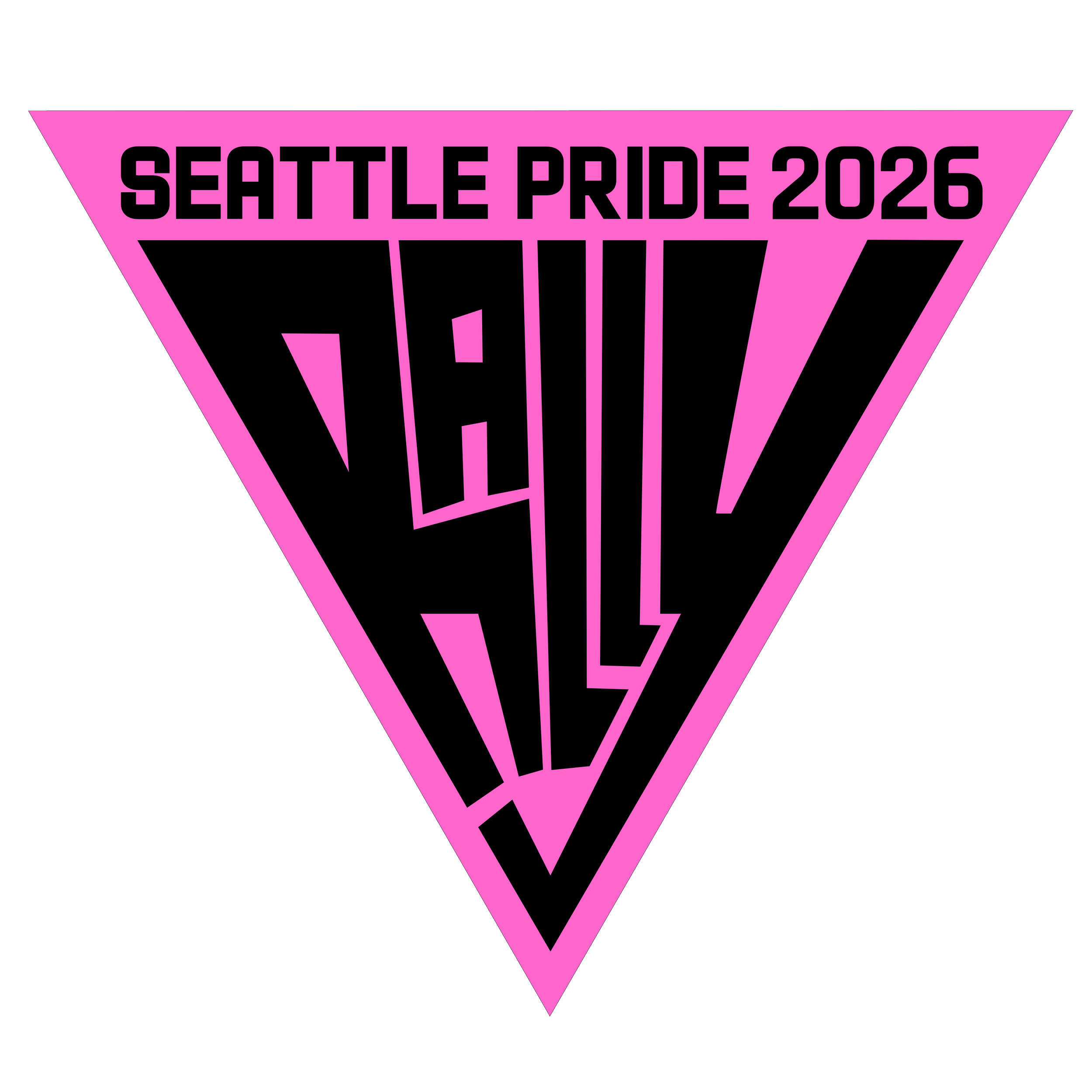
The pieces shown here were created for Seattle Pride's 2026 season: the primary logo for the year, plus a suite of embellishments used across flyers, ads, internal communications, and physical displays.
Posters & Ads
Designed and produced the full print and digital advertising campaign for the Seattle Pride Parade 2026 and Seattle Pride in the Park, both under the "Rally" theme. Deliverables included individual event ads, combined dual-event layouts, and roughly 20 size and format variations per design to cover the full range of digital placements and print specifications.
The poster designs were distributed across Seattle as physical posters and ran across digital channels simultaneously, requiring layouts that held up at both large-format print scale and small screen sizes. Managing that range of output formats while keeping the visual language consistent across every variation was a core part of the production challenge.
All custom embellishments, icons, and logo work incorporated into the ads were original assets created as part of the broader Rally brand system developed for Seattle Pride 2026.

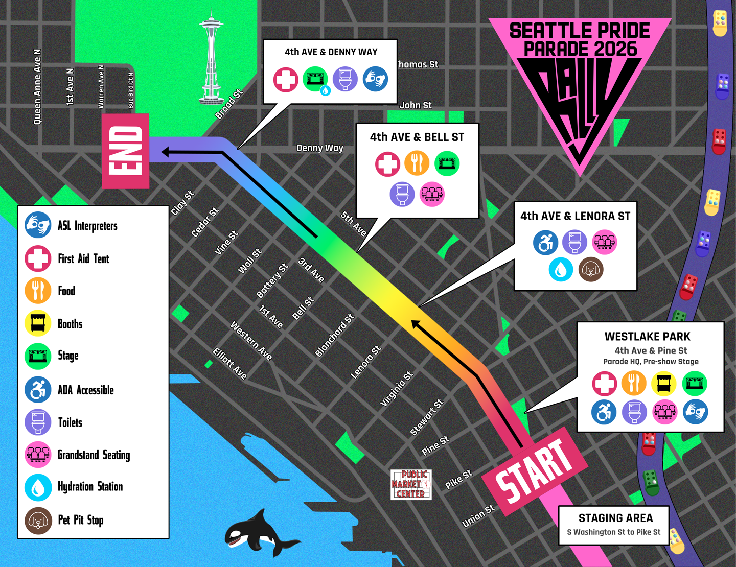
Map Design
Maps are UX. Even a static one has to make decisions about hierarchy, clarity, and how a person moves through information. Get those wrong and the map fails, regardless of how good it looks.
This map covers the Pride Parade route for Seattle's 2026 season, with key landmarks and tourist destinations layered in to give attendees real context for navigating the day. Every color and design choice is on-brand with the broader Seattle Pride visual identity, and the whole thing is built to A11y compliance standards.